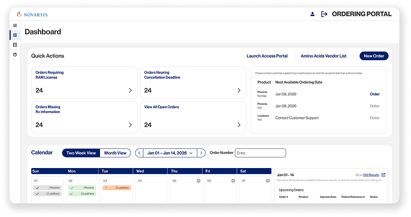
Healthcare providers use ROME to order cancer therapies with a strict five-day shelf life. Orders must be created quickly and accurately to ensure patients receive timely treatment.
What began as a six-month redesign became something much bigger. Over the next three years, I led product design through platform expansion, corporate rebranding, shifting business priorities, and four competing design systems while the product continued to ship and evolve into an enterprise platform.
Lead Product Designer
Novartis · 2023–2026
194 → 51UI tickets across six sprints
4.8+/5User satisfaction
20%Reduction in returns
51% vs. 32%Preference over competitors
ONE WEEK TO BUILD THE FRONT DOOR
I designed a multi-step flow on time and forgot Save as Draft.
CHALLENGE
Novartis Patient Services brought ROME under a larger enterprise umbrella. A second product, the Access Portal, was added in front of it. Access Portal is where healthcare providers enroll patients into the ecosystem and begin their treatment journey.
I was given the paper START form and a one-week deadline. The deadline reflected the state of the program. Business priorities kept shifting, stakeholders went back and forth, and nobody had a clear picture of the whole thing. They needed an MVP they could align on and use to secure resources as quickly as possible.
Neither the front-end nor back-end teams had been staffed. Salesforce had just been introduced to the project.
The goal was to define enough of the experience that engineering could begin on day one.
STRATEGY
The request was to digitize the START form, but I knew Access Portal needed more than a digital form. At a minimum, it needed a sign-in, a homepage, and an enrollment flow. With only a week, I kept the scope deliberately small.
Salesforce had already been selected, so I used SLDS2 out of the box with no custom components. It was faster to design against, and it meant engineering could build from stock components instead of specs I had invented.
The paper START form became my blueprint. I reverse engineered it, removed duplicate fields that appeared throughout the document, and reorganized the information around how providers naturally think about the patient rather than how the paperwork was processed internally.
Patient information came first, then patient insurance, then prescriber information. The two attestations went at the end, together. On paper, one of them sat in the middle of the document, so checking it meant jumping back through the form.
I then split the experience into a multi-step flow that followed that same progression.
WHAT I MISSED
I expanded the scope around the form. Inside the form, I followed the paper further than I meant to.
The paper START form was the only source material I had, and I stayed close to it. Save as Draft wasn't part of the document because paper doesn't need it. You put a paper form down when you get interrupted and pick it back up where you left off.
The form I designed had multiple steps. I forgot Save as Draft.
It came up after launch. Providers get interrupted constantly. A patient conversation, a phone call, insurance information they don't have on hand. They start the form, get pulled away, and come back later. Without a way to save, coming back meant starting over.
It became one of the first features added after the MVP. Digitizing the experience took away something paper gave users for free, and I stayed close enough to the source material that I didn't notice it was gone.
RESULT
Engineering started from a defined flow instead of a paper form. The enrollment flow, sign-in, and homepage were in place before the team was assembled, giving stakeholders something concrete to align on and take into resourcing conversations.
Using SLDS2 out of the box had a cost. Access Portal looked like Salesforce, and ROME looked like ROME. The ecosystem now had two products with different design languages and a fourth design system in play. Consolidating them became the next problem I took on.
From Frankenstein to One Source of Truth
ROME outgrew the systems that built it.
Challenge
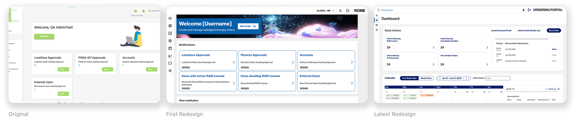
Corporate rebranding, a platform split, and rapid expansion turned ROME into a Frankenstein of mismatched styles, interactions, and components.
Without a single source of truth, design and engineering implemented new features inconsistently, compounding the problem with every release as development expanded to a new sister platform.
Strategy
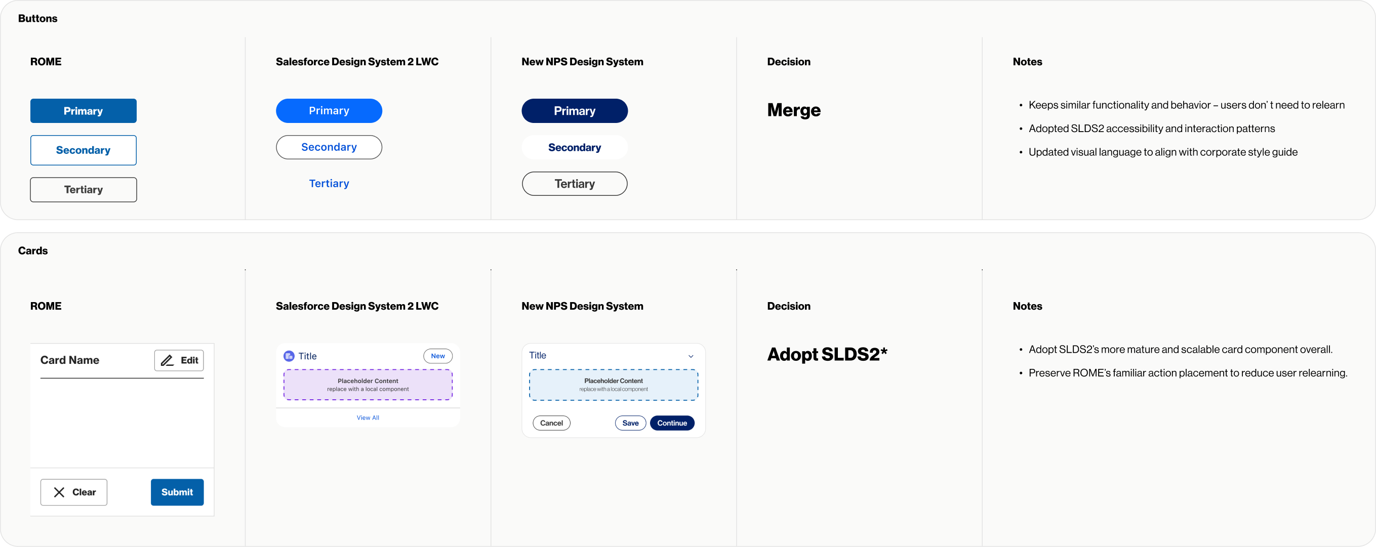
As the sister platform was being built on Salesforce Design System 2, an opportunity emerged. Rather than adding more duct tape and patchwork, I consolidated ROME and SLDS 2 into a single source of truth, creating a shared enterprise design system through a phased migration that minimized disruption while supporting ongoing product delivery.
Why a phased approach?
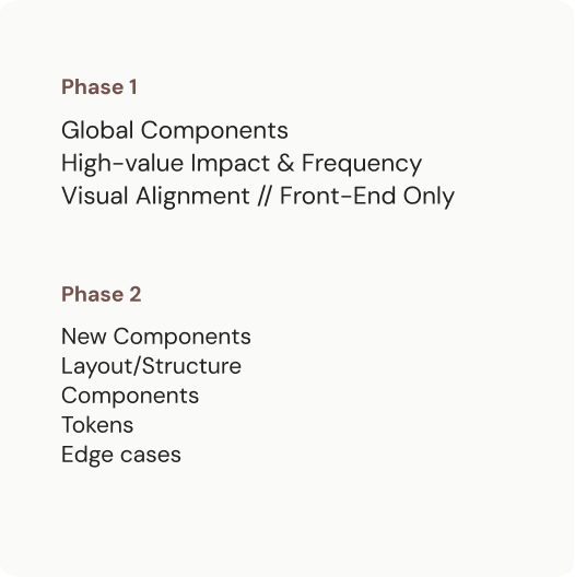
A full redesign wasn’t realistic. Product wanted a consistent experience, engineering couldn’t absorb the scope, and the business couldn’t pause feature delivery. Working closely with engineering, I prioritized global components and the most frequently used pages first, creating a phased migration that balanced all three.
Result
Established the NPS Design System as the single source of truth for design and engineering across enterprise platforms.
Replaced competing design systems with a shared component library that provided a consistent foundation for future development.
Everything Everywhere Needs to Be Fixed Right Now
1px misalignment and broken primary buttons in the same hot-fix.
Challenge
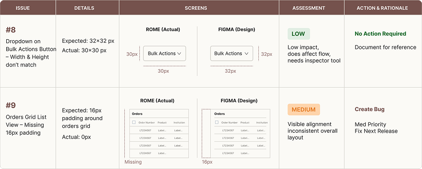
UAT uncovered an average of ~35 UI issues per sprint during redesign. Findings ranged from minor inconsistencies to broken interactions that prevented user progression. Every issue entered the engineering queue with the same priority.
Without a shared way to evaluate UI quality, discussions increasingly shifted from fixing problems to debating ownership and severity.
~35 bugs per sprint
Strategy
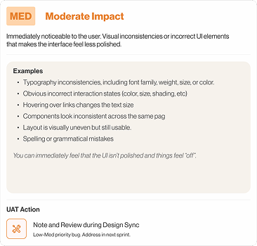
To address this, I created a UI Quality Framework that prioritized issues based on user impact, frequency, and visual severity. Clear definitions, examples, and weekly review sessions gave design, engineering, and UAT a shared standard for evaluating UI issues and determining what should be fixed immediately, deferred, or accepted.
Result
Reduced UI tickets sent to engineering by 74%, from 194 to 51 across six sprints.
Established a shared standard for evaluating UI quality, helping design and UAT align while engineering focused on higher-impact issues.
Reduced review sessions from weekly to biweekly as the backlog stabilized, returning time to product work.
A platform in continuous evolution
Unlike a traditional redesign, ROME wasn’t a one-time effort. Over several years, I led product design across new workflows, platform migrations, quality initiatives, and design system evolution. Each challenge was different, but the objective remained consistent: reduce complexity, improve consistency, and leave the product in a better state than the previous release.